a11yTips
29. Accessibility Interview Questions - Part 5
21 May 2021You can read part 1, 2, 3, and 4 here:
31: How using animation in an interface affect the user experience?
As per WCAG animations should follow:
Animation should be under 5 seconds
There should not be more than 3 flashes
User should have the can stop, pause, replay the animations
The reason is if there are too many flashes then it will cause seizures. Not giving control to the users to stop auto-play, pause, replay the animations will impact the user experience.
32: How to make animations accessible?
WCAG has guidelines around it. Below are the 3 things I can share for now:
Avoid having unnecessary animations
Avoid having auto-play animations
Always give the control of animation to the users to control: play, pause, rewind, etc of animation.
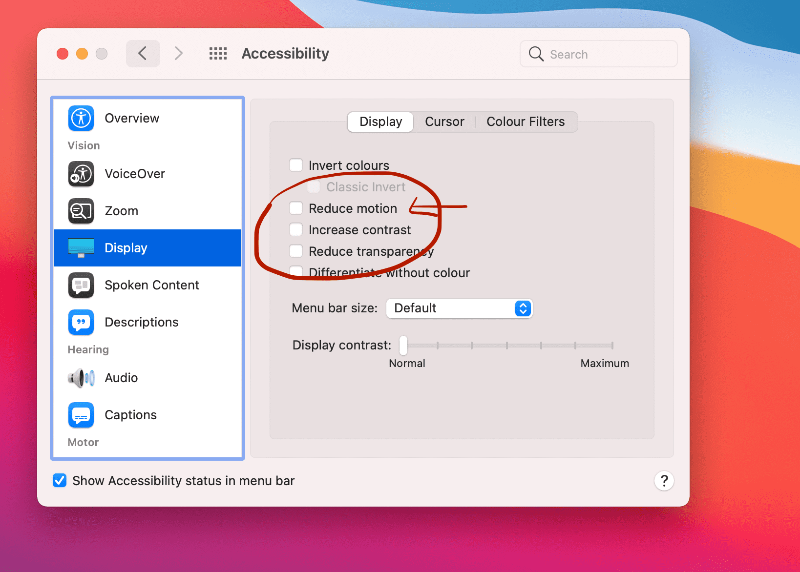
Think about the fallback. Eg: users who are not comfortable with animations must have changed their system's settings 'prefer-motion-reduced'. Due to this the animation won't play. Hence, it is important to have the fallback of animations. Below code is from MDN
.animation {
  animation: pulse 1s linear infinite both;
}

/* Tone down the animation to avoid vestibular motion triggers like scaling or panning large objects. */
@media (prefers-reduced-motion) {
  .animation {
    animation-name: dissolve;
  }
}

This is the screenshot of Mac OS' system preferences.
33: What is focus-trap?
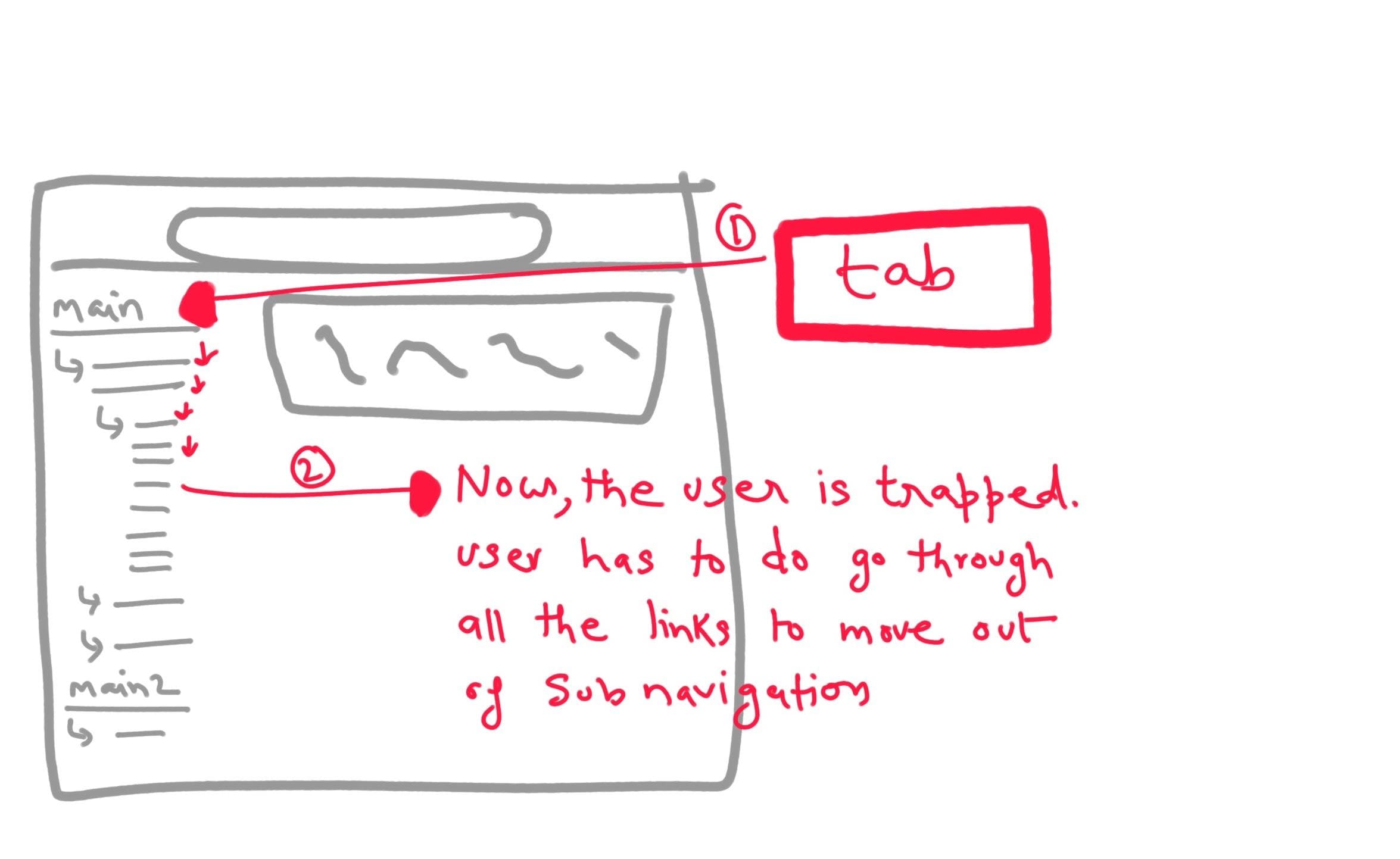
`focus trap is related to the keyboard accessibility. When we have left long navigation with sub-navigation or carousels or a module with a lot of controls then how the flow of the keyboard should be?
If there is no clarity there are 100% chances that the user's keyboard focus will be stuck in a place and won't be able to come out.
Eg: Here is an example of the sub-navigation.

34: Give an example where you have to change the tabindex
In SPA while selecting a page (route) when we need the focus to be on the main content at that time we need to change the tabindex.
35: What is access-keys
access-keys are known as the shortcut keys or the hotkeys. A lot of users are very comfortable using the hotkeys while accessing the web. Every browser and OS has a hotkey to access their access keys. The access key is always a single character.
Eg: OS/Browser hotkey + H (this is to access Heading)
Do take care that access-key should never override the global hotkeys. Eg: S is used for saving. Do not make it to do for some other task, and provide a shortcut key guide for users to educate.
36: Are ARIA tags picked by SEO?
No, ARIA tags don't get picked by SEO. ARIA-* tags are for providing extra in
37: What are the accessibility issues with the gifs?
Though GIFs are an engaging and popular way of adding fun elements GIFs are not accessibility friendly. Below are the issues with the GIFs
1. Autoplay:
GIFs autoplay and in the loop. It doesn't provide any control to the user to stop it. It is breaking the accessibility rule. The solution of fixing this is either control the play/pause of GIFs by JavaScript or use the VIDEO tag of HTML to replace the GIFs
2. User doesn't have control of the animation:
Not just play/pause, GIFs don't have any control for the users. This again breaks the rule of accessibility. Hence, it is important to provide control such as settings of reducing the play rate, etc. The solution would be to replace the GIFs by VIDEO tag.
3. No alt tag: Provide the alt tag to make the gif accessible for screen readers.
38: If you have to develop carousels what are the top 3 things you will take care of for accessibility?
As per the WCAG, there are a few things to take care of while building the carousel for accessibility.
1. Controls:
While designing/developing carousels, make sure you are providing the controls such as play, pause, indicators of a number of slides, a thumbnail of the next slide.
2. alt tags:
It is important to provide alt tags of the images (if using) in the carousels for accessibility.
3. Mobile support:
Make sure that carousels is optimized for the mobile screen.
4. Content:Images:
One more area to take care of is the content should be readable with images or graphics. Color contrast and font size should be as per the WCAG guidelines.
39: When to use role="article" and HTML5 article?
When we are not using semantic HTML tag <article/> in such case we can leverage the use of role=article or when we want a particular section to behave as article only for the screenreader users in that case we can use role=article.
However, always use the semantic tag HTML5 article.
40: What is the use of aria-required?
aria-required is useful tag to notify the screenreader users about which input fields are 'required'. Remember, the red astrik or visual presentation which UX folks use to indicate the required fields will not be useful for the screen-reader users. Hence, 'aria-required` is useful it takes boolean value.
<input type="text" required aria-required="true" />
Happy Learning!!
Like it? Any question? or just want to say Hi!! Follow me at Twitter and Linkedin