a11yTips
42. Accessibility - CSS flexbox, and grids
27 May 2024CSS flexbox, and grids are the most used method to create the layouts. However, as a developer we should be aware of the accessibility issues associated with these
1. flexbox:
Flexbox is a powerful tool for creating flexible layouts in either rows or columns. The flex-direction property allows you to reverse the order of rows and columns. However, reversing rows and columns using CSS alone can lead to accessibility problems. Why? Because the reversal only affects the visual presentation, not the underlying HTML structure.
How this will impact accessibility?
Screen readers and keyboards follow the HTML layout, not the visual layout. This means that the content presented to users of screen readers and keyboards will be different from what sighted users see. Important information might be missed or presented out of order, leading to confusion and a poor user experience.
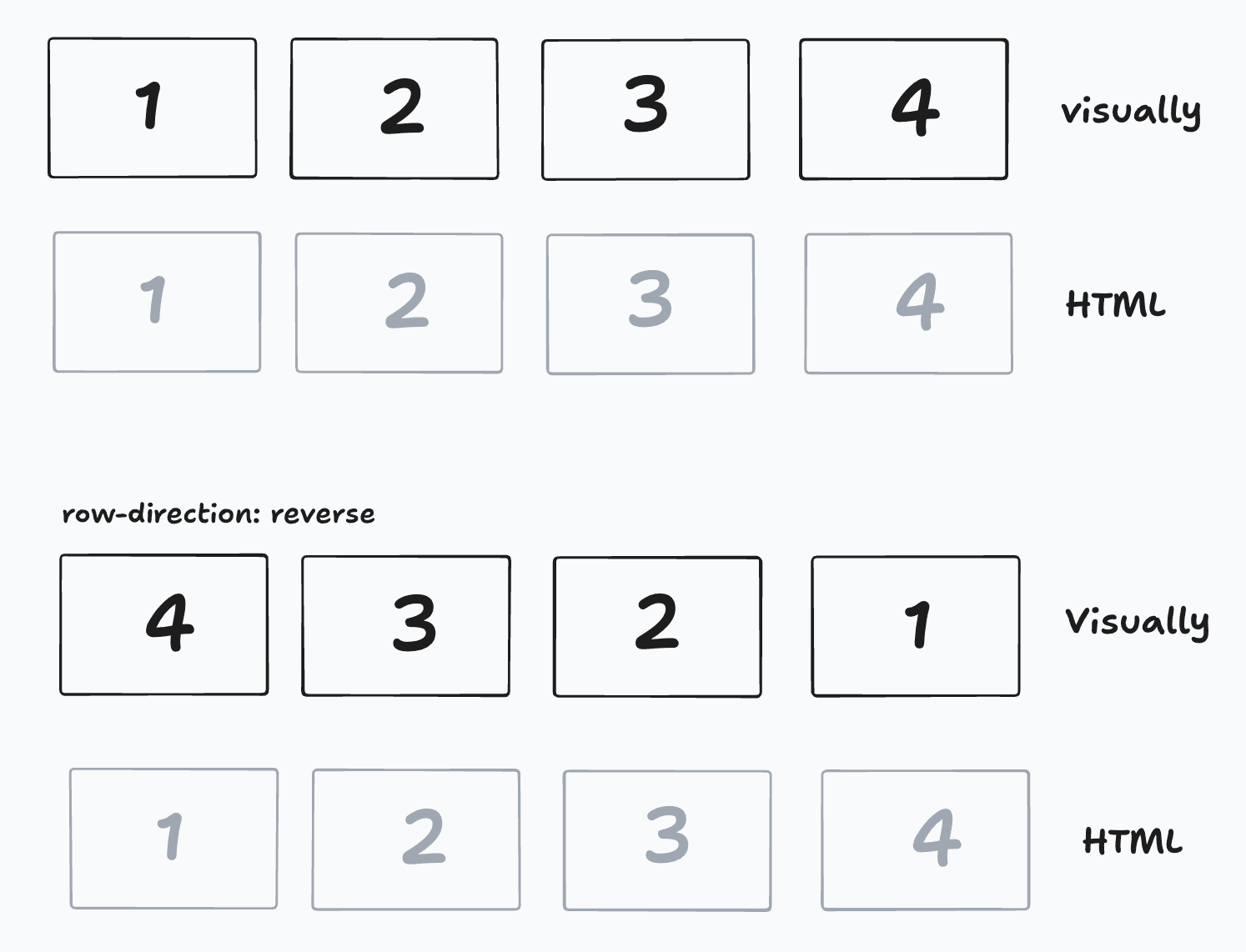
Solution: Ensure that your visual and HTML layouts follow the same order. Do not rely solely on CSS to control the UI layout. Instead, structure your HTML to reflect the intended visual order.
2. grids
Similar to flexbox, CSS grids allow you to create complex layouts with rows and columns. The grid-template property enables developers to define and control the layout from CSS. However, just like with flexbox, using CSS grids to control the layout can negatively impact accessibility.
How this will impact accessibility?
If you use CSS grids to reorder elements visually without changing the HTML order, screen readers and keyboard users will experience the content differently from sighted users. This can cause important information to be lost or misinterpreted.
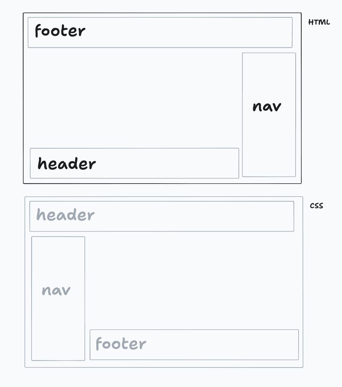
Solution: Align your visual and HTML layouts. Ensure that the order of elements in your HTML matches the visual order presented by CSS grid
Happy Learning!!