a11yTips
14. Accessibility Audit - Myntra.com
16 July 2020
UPDATE: Added two more use-cases where the accessibility is breaking. (1) Pop-up to subscribe to the notifications. (2) The feedback email Myntra send to rate the browsing experience.
A few days back I did Swiggy's accessibility audit. I wanted to see how my most used products are doing in accessibility.Read about Swiggy's Accessibility Audit
Thanks to the Swiggy team they acknowledge the gap and mentioned they will work on it.
Today I will show you how Myntra is doing in accessibility. Myntra.com is leading fashion e-commerce website. It is one of my most used product.
DISCLAIMER: I am not trying to put any product down. My attempt here is to highlight the importance of Accessibility and create awareness around it.
What was good:
- Top navigation was accessible till the search Field.
- Able to do a search through the keyboard.
- Able to go to search results from search in the top navigation. Brownie points - can navigate to search results by pressing 'ENTER' key rather than navigating on just selecting the suggested search result by ARROW KEY
- Able to access the product detail page.
Where it failed?
- No skip to content link
- On home page - after the search field, the keyboard focus is not there (focus blue line is missing)
- Home page carousels and images are not accessible.
- On the search result page after breadcrumbs, nothing is accessible by keyboard.
- Product detail page - not able to view product images, select size (it was a struggle to reach and select the size).
- Not able to add the item to bag and nor able to add to the wishlist.
- Hard to access 'size chart' by the keyboard. If somehow able to access, the pop-up is not accessible
How to do keyboard testing:
TABkey to move to the next element.SPACEkey to select anything.ENTERkey for action.TAB + SHIFTkey to move to the previous element.
Live video of Review:
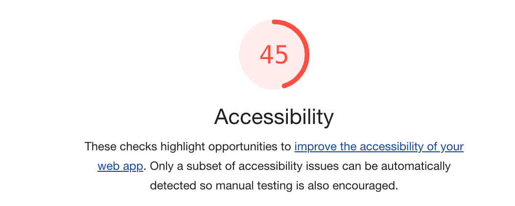
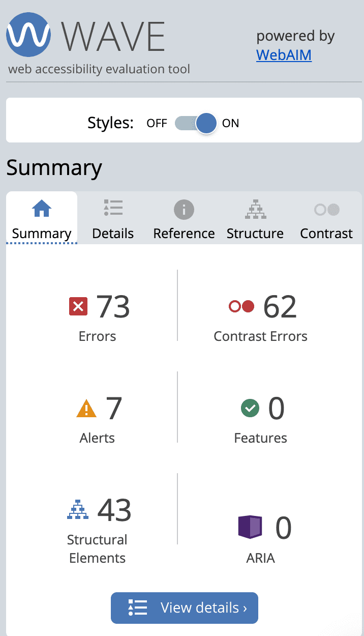
Lighthouse and Wave Tool report:


Subscribe to Web Notifications
Subscribe to the Web notifications is a way to keep the user engaged and push the notifications to the user's browser who so ever will opt for it. This is a pop-up which comes over the site once you visit it with 2 option - 'subscribe' or 'Not Now'.
In Myntra, the pop-up is not at all accessible by the keyboard. I am not able to close it or choose an option. The focus always stays behind the pop-up.Now, for disable person this is a feature they ll never able to know is there.

Rate the Browsing Experience
Myntra send an email to 'rate your browsing experience'. Unfortunatlty there is no option to rate on Accessibilty.
Happy learning!!
(Photo by Editors Keys on Unsplash)