a11yTips
3. Build Accessible forms
5 March 2020Forms on every website or app are most crucial. The reason is simple they bring the business. If you are an e-commerce website then people would be using it to place orders, or do payment. If you are an education website then people would be using it to fill the admission forms. etc.
A non-accessible form simply means a loss in the business.
Today we are going to learn what makes the forms non-accessible
Common Mistakes:
1) Using only colors for errors and success
Many times UX designers decide to use the colors to communicate the state of the submission of the form - success or errors. This is not accessible by screen readers as well as to the folks who have color blindness problem. Always provide a clear and descriptive reason why the form is not getting submitted successfully.
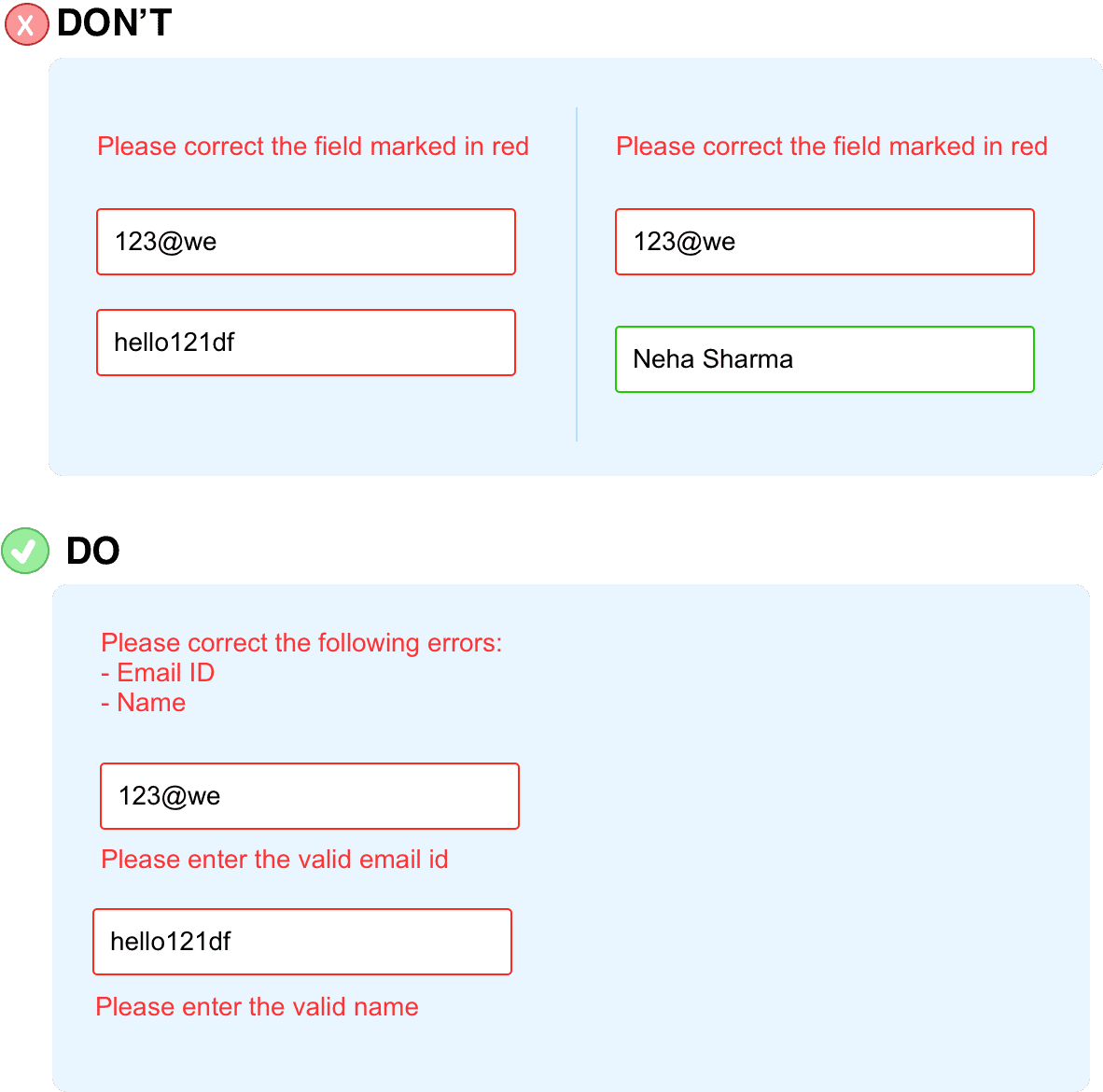
2) No descriptive errors
As stated above, always provide descriptive and clear error states. I have seen the errors like : "Please correct the errors", "Please enter valid username", .etc. Form author needs to clearly explain what do you mean by 'valid', which error to be corrected, and what to be corrected?
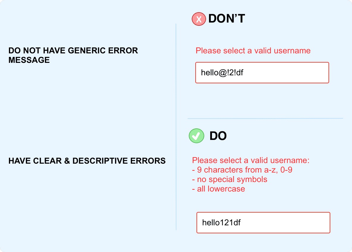
3) Missing descriptive helper text
To have accessible forms it is mandatory to provide the descriptive and clear helper text. This will help the users to understand the expected input and they can enter without any mistake. Eg: if the expected password is 9 characters without any special symbol then do mention is clearly before the user enters the input.
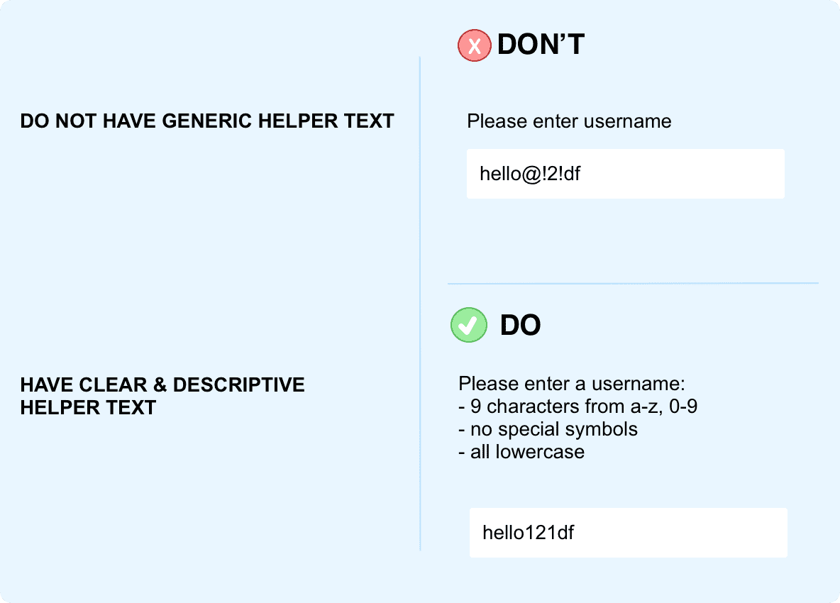
4) No labels of the form
Another common mistake folks do with forms is they do not keep labels separate from the input fields. This is in fact very common and I would say the very favorite style of the UX folks to have labeled as placeholders or as Material design system has label overlapping input fields.
Both are incorrect, reason, labels are important for the screen readers, folks suffering from cognitive, folks who are new to web and need to understand which field is related to what?
The best practice to always have labels.
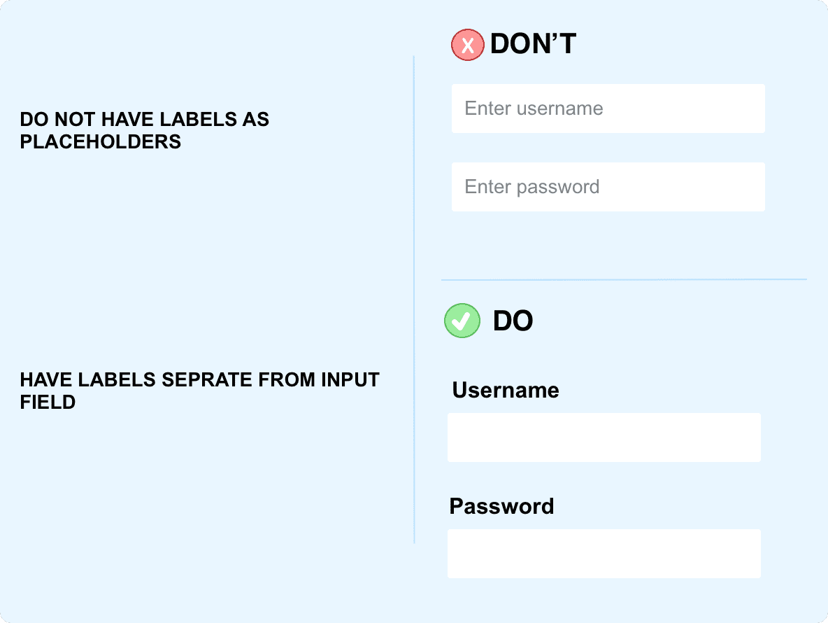
5) Labels are not related with the input
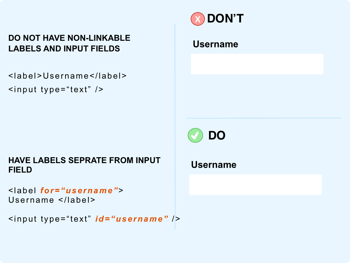
How screen readers read the input fields and relate to the label? Well, a small HTML attribute does the magic. Now, imagine when there is no attribute. Well, all the screenreaders user end up hearing is - "Input field..". Hence, it is important to link the labels with the input field using the attribute.
6) No legends of radios and checkboxes
Legends are very important for checkbox and radios. The reason is for screenreaders and keyboard supporters. Legends help the screenreaders users to understand
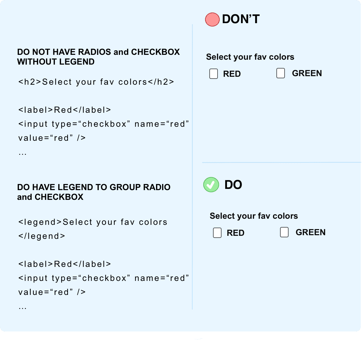
7) Button for semantic
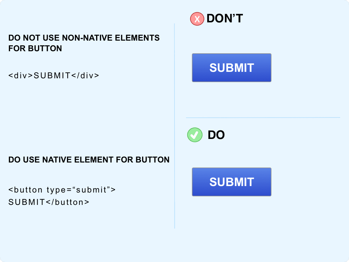
Another common mistake to avoid is not having a semantic button tag for the button. The rule here is the same use semantic HTML tags over custom tags. This will help in avoiding a lot of issues such as - focus, screen readers, etc.
8) Helper Text or Tool Tips for screen readers
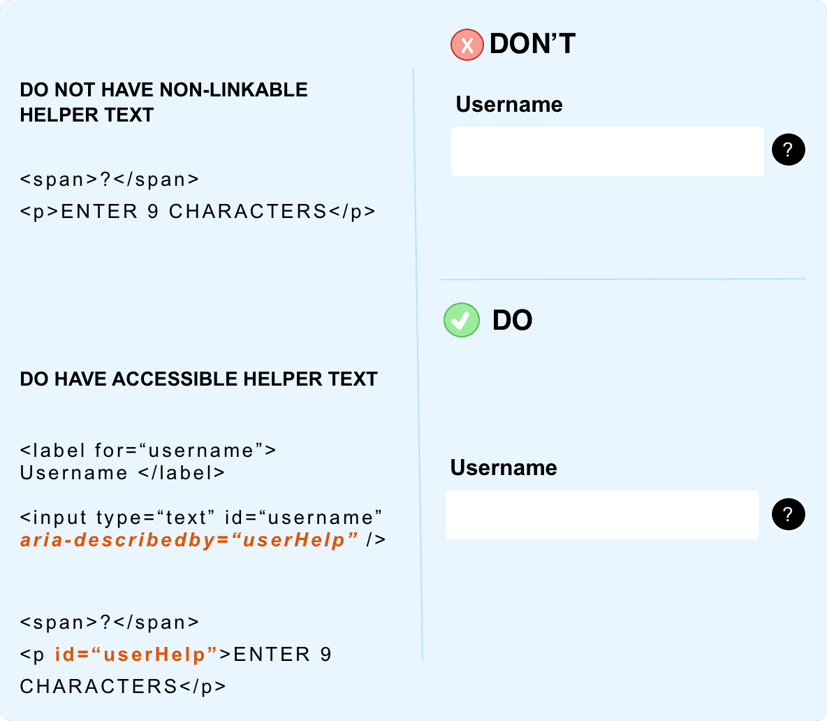
The most common way of having helper text is having a tool-tip like UI and experience but again the challenge is folks miss out on how screen readers will get to know that what is in the helper text? Well, there is aria-described to help.
Here is the code example
9) Keyboard support
I kept this at the last, but this is very important to understand and I want to leave you all with this as a closing note. Forms are made up of - radio, checkbox, dropdown, number input.
Now, how a keyboard user can interact with these? There is the default behavior and every keyboard user is aware of it. So, do not try to break or change the default behavior.
a) Radio: Spacebar key
b) checkbox: Spacebar key
c) dropdown: Enter key to enter the dropdown, arrow keys to select the values and enter key to select
d) number: unless and until you are using arrow icons to indicate up & down to increase and decrease the value
Here is the code of the Accessible form
Happy learning!!